
French Country Paint Colors: The Best (and Absolute Worst) Shades to Choose
Picking the right French country paint colors is key to nailing that rustic cottage look found in France. But there are so many choices available it’s hard to know where to start. Whether you’re refreshing a kitchen, brightening a bedroom, or giving your exterior a classic Provençal touch, color plays a key role in creating cozy farmhouse vibes.
French country style is all about balance, muted tones, earthy neutrals, and soft pastels that work in harmony with natural materials like wood, stone, and linen. But not every shade works. Some hues will transport you straight to Provence, while others might leave your space feeling more “oops” than “ooh la la.”
It’s all about finding that perfect balance between warm and cool tones to create a welcoming atmosphere that exudes that quintessential French style. In this quick start guide to French cottage paint colors, you’ll find out which hues define the style, how to avoid common pitfalls, and which colors to choose.

How to Choose Vintage French Country Paint Colors
Before committing to a paint color, it’s essential to consider how it interacts with the light, textures, and overall ambiance of your space. French country home interiors embrace warmth and softness, so look for hues with muted, earthy undertones rather than anything too stark or cool.
Always test paint swatches on your walls at different times of the day. Natural light can shift a color dramatically, and what looks perfect in a store may feel too harsh or dull in your home. Pair your chosen shade with the elements already in your space, such as exposed wood beams, stone floors, or linen furnishings, to ensure everything blends harmoniously.
And most importantly, opt for timeless, weathered tones over trendy shades. French country farmhouse interior design is all about effortless elegance that feels like it’s been there for generations.

When Too Much Is Just Too Much
Ever been to a party where someone’s perfume was so strong you could taste it? That’s what happens when colors get out of hand in French country decor.
Using too many different colors can make a room feel chaotic. It’s like trying to listen to jazz, pop, and classical music simultaneously – confusing!
Stick to a limited palette of 3-4 colors max. This creates a harmonious look that’s easy on the eyes. Think of it as creating a simple melody rather than a complex symphony.

The Best French Country Decor Paint Colors (Timeless, Warm, and Authentic)
The best French country cottage color palette has a timeless, lived-in quality that makes a space feel warm, inviting, and effortlessly elegant. These shades are inspired by nature: soft whites that mimic sun-bleached linen, muted greens reminiscent of olive groves, and warm taupes that echo aged stone.
Whether choosing French country bedroom paint colors or French country bathroom paint colors, the key is choosing hues with depth and softness—nothing too stark, too bright, or overly saturated. My favorite choice is the range of French Country Sherwin Williams Paint whenever I’m looking for new colors.
Soft Warm White
French country off white paint colors are the foundation color in French country interior design style, bringing a sense of light, airiness, and understated elegance. Unlike stark whites, which can feel too clinical, warm whites have subtle beige, cream, or greige undertones that create a cozy and inviting atmosphere.


They work beautifully in any room, whether a kitchen bathed in natural light or a bedroom, where soft textiles enhance the warmth. This shade pairs perfectly with rustic wood beams, aged stone floors, and antique furnishings, allowing other elements in the space to shine without overwhelming them. My lounge walls are painted an antique white, which works so well with the wooden beams, fireplace, and wooden floor.
The key is choosing a warm white with the right undertones. Too much yellow can make it look dated, while too much gray can make it dull. A well-balanced shade, like Sherwin Williams Alabaster, provides just enough warmth to avoid looking sterile while still feeling fresh. For a more vintage look, Farrow & Ball Pointing offers a timeless creaminess that works beautifully with French country décor.
Aged Linen or Taupe
Aged linen and French country taupe paint colors are warm neutrals that sit comfortably between beige and gray, offering depth without overwhelming a space. They bring an old-world elegance that is perfect for creating that rustic, timeworn charm that defines the style. They add a soft warmth that pairs beautifully with exposed wood beams, antique furniture, and natural textiles like linen and wool.

The key to choosing the right taupe is avoiding shades that are too cool, as they can feel stark and out of place in a country setting. Aged linen tones, like Farrow & Ball Shaded White, have a subtle warmth that works well in bright and dimly lit rooms, making them an excellent backdrop for layered textures and patinaed finishes.
If you prefer something slightly richer, Benjamin Moore Revere Pewter offers a classic greige that balances warmth and sophistication. This versatile shade complements everything from muted blues to soft greens.
Muted Sage Green
Muted sage greens are the best soft green paint colors to use, as they bring a touch of nature indoors. Inspired by the soft, weathered greens found in the French countryside, this shade exudes a sense of tranquility and warmth. Unlike bolder greens, muted sage has an earthy, slightly gray undertone that keeps it from feeling too bright or overpowering.


It blends well with natural materials like aged wood, stone, and wrought iron, reinforcing the rustic elegance of French country style. It pairs particularly well with warm whites, taupes, and soft blues, making it a versatile choice for large and small spaces.
The best sage greens have a soft, powdery quality that enhances the cozy, lived-in feel of a space. Benjamin Moore Saybrook Sage is a perfect example, offering just the right balance of warmth and muted sophistication. For a slightly dustier option, Farrow & Ball Lichen provides a historical, heritage feel that works beautifully in traditional country homes.
Dusty Blue or Slate Blue
French country blue paint colors are some of the most popular you’ll see in the French countryside. They’re used on antique shutters, weathered cabinetry, and centuries-old châteaux. These muted blues have a hint of gray, giving them a softer, more aged appearance.


Unlike vibrant or overly cool blues, dusty and slate tones feel natural and subdued, blending beautifully with warm neutrals, natural wood, and stone accents. They add depth and sophistication without overpowering a space, making them ideal for kitchen islands, built-ins, or even bedroom walls. These blues pair effortlessly with warm whites, taupes, and muted greens.
When choosing the right shade, avoid blues that are icy or bright, as they can feel too modern or coastal rather than rustic and timeless. Behr French Colony is a gorgeous dusty blue with a vintage feel, while Farrow & Ball De Nimes has a slightly deeper, more moody slate tone.
Buttery Yellow
This soft, sun-washed hue brings a sense of cheer and coziness without feeling too bold or overpowering. Unlike bright or neon yellows, buttery yellow has a natural, slightly muted quality that makes it easy to incorporate into interiors. It works beautifully in kitchens, dining rooms, and living spaces, where it enhances natural light and creates an inviting, welcoming atmosphere.


Buttery yellow pairs beautifully with soft whites, muted greens, and warm taupes, creating a classic French country palette that feels effortlessly elegant. Whether used on walls, cabinetry, or accent pieces, this shade brings a touch of Provençal sunshine into any home.
The key to using buttery yellow is finding a shade with the right balance of warmth and softness. French country Sherwin Williams yellow paint colors are among some of the best.
Warm Terracotta or Clay
Warm terracotta and clay tones bring an earthy, old-world charm to French country interiors. Inspired by the sunbaked tiles of Provence and the rich soil of the French countryside, these hues add warmth, depth, and a touch of rustic elegance.


Unlike bold reds or oranges, terracotta feels natural and timeless in its softer, muted form, making it an excellent choice for accent walls, kitchen backsplashes, or exterior trims. It pairs beautifully with natural materials like stone, wood, and linen, reinforcing the effortless, lived-in feel that defines French country style.
Opt for shades with a soft, weathered appearance to keep the look balanced rather than anything too bright or overpowering. Dunn Edwards Adobe South offers a beautifully muted terracotta, while Farrow & Ball Red Earth has a slightly more faded heritage feel that blends seamlessly into rustic interiors. These tones work particularly well with warm whites, sage greens, and deep blues, creating a color palette that feels rich and grounded.
Powdery Rose or Blush
Powdery rose and blush tones add a soft, romantic touch to French country interiors, bringing to mind faded textiles, antique wallpaper, and delicate Provençal florals. It’s perfect for those who love shabby chic color palette colour schemes. These muted pinks have a dusted, almost vintage quality, making them far more versatile than traditional bright pinks.
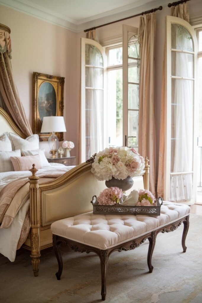

Powdery rose works beautifully in bedrooms and dining spaces or even as an accent on furniture, blending with neutral tones, soft blues, and warm whites.
The key is choosing a blush with subtle, earthy undertones to maintain a natural, timeworn look. Benjamin Moore First Light is a delicate, warm blush that feels soft and airy, while Farrow & Ball Setting Plaster has a slightly richer, peachy tone that pairs beautifully with aged wood and linen fabrics. These hues add a touch of understated elegance without feeling overwhelming.
Worst French Country Paint Colors (Too Harsh, Too Cold, or Overly Trendy)
Some paint colors can instantly take a French country space in the wrong direction. Shades that are too stark, too cool, or overly trendy can strip away the warmth and timeless charm that define the style. Avoid anything that feels too crisp, overpowering, or modern, especially the five below.
Stark White or Cool White
Stark white and cool white may seem like safe, clean choices, but they work against the cozy, timeworn charm that defines French country style. These shades lack the warmth needed to create that inviting, lived-in feel, making a space look cold, sterile, or overly modern.
Instead of complementing the natural textures of a French country home, like stone floors, exposed beams, and antique furniture, stark whites can feel harsh and out of place. They can even take on a blue or gray undertone in rooms with limited natural light, further amplifying the sense of coldness.
If you’re set on a white shade, consider one with subtle beige or cream undertones rather than a crisp, bright white. French country interiors thrive on warmth and softness, so avoiding stark, cool whites will help maintain that inviting, relaxed elegance the style is known for.

Bright or Neon Colors
Bright or neon colors have no place in a French country home. The style is rooted in natural, muted tones reflecting the French countryside’s rustic beauty. Vibrant reds, electric blues, neon greens, or bold oranges can feel jarring and completely out of sync with this aesthetic’s understated elegance. Instead of enhancing a space, these loud colors overpower it, creating a look that feels more modern or eclectic than classic and timeless.
If you love color, opt for muted, dusty versions of your favorites. Instead of a bright, citrusy yellow, choose a soft, buttery shade like Farrow & Ball Hay. Instead of a bold cobalt blue, go for Farrow & Ball De Nimes, which has a gently weathered feel. French country interiors should feel warm, relaxed, and naturally aged; colors that are too bright or synthetic will break that harmony.

True Gray with Cool Undertones
True gray with cool undertones might work well in modern interiors, but it rarely suits a French country home. The undeniable charm of this style comes from warmth, softness, and a timeworn feel, qualities that cool grays often lack. These shades can make a space feel stark, impersonal, or even slightly industrial, clashing with the rustic elements that define French country interiors.
In rooms with limited natural light, cool grays can take on a blue or almost metallic undertone, making the space feel cold and uninviting rather than cozy and elegant. If you’re drawn to gray, opt for a warm greige or mushroom tone instead. Benjamin Moore Revere Pewter and Farrow & Ball Elephant’s Breath both have subtle warm undertones that bring depth without feeling too cold.
These shades pair beautifully with antique wood furniture, stone floors, and soft linen textiles, helping to maintain the relaxed, inviting atmosphere that makes French country homes so appealing. When choosing a neutral, always lean toward hues with a hint of warmth to keep the space feeling lived-in and welcoming rather than stark and unbalanced.

Cool Blue or Icy Blue
Cool blue or icy blue may seem like a fresh, calming choice, but in a French country home, these shades can feel too crisp, modern, and detached from the warm, rustic charm the style is known for. The French countryside is all about soft, timeworn hues such as muted gray blues that mimic aged shutters and weathered linens.
In contrast, icy blues often have a high concentration of white or gray undertones, making a room feel cold, overly contemporary, or even sterile, especially when paired with the natural materials common in French country interiors. If you love blue, opt for a tone with warmth and depth. Farrow & Ball De Nimes offers a beautiful slate blue that feels aged and elegant, while Sherwin Williams Windy Blue brings a subtle grayish tint that keeps it from being too bright.
Harsh Black or Dark Charcoal
Harsh black or dark charcoal can be striking in modern or industrial spaces, but these deep tones often feel too heavy and overpowering in a French country home. Used in large amounts, black can absorb light and make a space feel closed-in rather than inviting. It also contrasts too sharply with the softer, muted palette that defines French country design, creating a look that feels more contemporary than rustic and lived-in.
That said, if you love the idea of using black, opt for a softer, weathered version with brown or warm gray undertones. Farrow & Ball Railings offers a deep, moody shade that feels more like an aged, inky blue than a stark black. For a softer charcoal, Benjamin Moore Kendall Charcoal pairs beautifully with warm whites and natural wood, helping to maintain balance without feeling too harsh.
Instead of using black as a dominant color, consider incorporating it in small doses, like distressed metal hardware, antique wrought-iron details, or aged picture frames.
Bringing It All Together: Choosing the Right French Country Paint Colors For Home
The right paint color can transform a space, setting the perfect backdrop for the rustic elegance of the French country style. The key is balance, pairing the right colors with natural textures, vintage details, and a lived-in feel that makes your space feel welcoming and effortlessly beautiful. When in doubt, opt for warmth, subtlety, and classic shades that stand the test of time.


